#T13
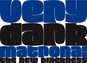
Typeface: Matrona
Typeface Designer: Hubert Jocham, Lautrach, Germany
Foundry: Hubert Jocham Type
URL: http://www.hubertjocham.de/
Designer’s Concept:
When letterpress started with the Gutenberg Bible, the typeface was like a texture. Before humanism, type did not really need to be legible. The letters were rather drawn in an ornamental way. It filled a space. My idea for Matrona was to create a similar structure. I wanted it to be very bold and still as legible as possible. The result was a headline typeface that can fill spaces. You can even fill it with a picture. Or you create an ornament with contents. There are three weights to extend the usage to different sizes. ]]>
#T1
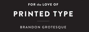
Typeface: Brandon Grotesque
Typeface Designer: Hannes von Döhren, Berlin, Germany
Foundry: HVD Fonts
Members of Typeface Family/System:
Thin, Thin Italic, Light, Light Italic, Regular, Regular Italic, Medium, Medium Italic, Bold, Bold Italic, Black, Black Italic
Designer’s Concept:
My father gave me some magazines from the 1920s and 1930s, which he had found at my grandfather’s; he thought I should have a look at the hand-lettered advertisements. I was fascinated by the surface feel and by the general atmosphere of these magazines; the way the body type was set and the various combinations of typefaces and hand-lettered headlines.
I absolutely wanted to create a typeface with that kind of feel. A geometric face that nonetheless would possess a certain softness and warmth. Because of “bad” printing, the text faces in those magazines had slightly rounded corners, lending them an emotionality that today’s clean-cut type lacks. So I decided to give Brandon slightly rounded-off corners to allow it to radiate warmth in spite of its geometric clarity. Although Brandon with its 12 styles is a relatively large family, each weight has its own aesthetic, for while the weights are based on each other they were all drawn separately in order to give each variety its own details — like the various ‘g’ variations or the perfectly round counters in the Black weight. A real italic was designed to provide additional individuality and to distinguish the font from most other geometric sans faces, making it even more ‘human’. ]]>
 #T2
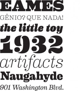
#T2Typeface: Eames Century Modern
Typeface Designer: Erik van Blokland, The Hague, Netherlands
Foundry: House Industries, Yorklyn, Delaware
Members of Typeface Family/System:
Regular, Regular Italic, Book, Book Italic, Light, Light Italic, Thin, Thin Italic, Medium, Medium Italic, Bold, Bold Italic, Extra Bold, Extra Bold Italic, Black, Black Italic, Stencil, and Stencil Cameo
Designer’s Concept:
Charles and Ray Eames did not design a typeface and this project was not about creating fonts that they would have drawn had they felt the need or inspiration to do so. It was about creating a tool that had the same universal appeal as monuments to the Eames aes- thetic, many of which have been so ingrained in our visual landscape that we barely notice them. Eames Century Modern is crafted in the same vein; its dignified legibility effectively transmits the message without overpowering the medium while devilishly intoxi- cating details in words, letters, serifs, spaces, stems and tapers find their way into the subconscious of even the most casual observer. Much like waiting in a departure lounge on Eames system airport seating; you don’t know why you’re comfortable, you just are. ]]>
#T3
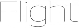
Typeface: Aero
Typeface Designers: Chester Jenkins and Jeremy Mickel, Brooklyn, New York, and Providence, Rhode Island
Foundry: Village Type and Design
URLs: http://www.vllg.com/
Members of Typeface Family/System:
Fine, Fine Italic, Thin, Thin Italic, Extralight, Extralight Italic, Light, Light Italic, Book, Book Italic, Medium, Medium Italic, Bold, Bold Italic, Heavy, Heavy Italic, Super, and Super Italic
Designers’s Concept:
Aero takes inspiration from Roger Excoffon’s landmark design Antique Olive, particularly the heavy “Nord” weight. Instead of revis- iting the original, Aero was drawn from memories of Antique Olive: its high-waist and reversed contrast. And that wonderful scooped lowercase i. The result is a contemporary reflection of a 60s-era classic, with the volume turned up and applied to a wider weight range. ]]>

#T4
Typeface: Palatino Sans Arabic
Typeface Designer: Nadine Chahine, Bad Homburg, Germany
Foundry: Linotype GmbH
Language: Arabic
Designer’s Concept:
The Palatino® Sans Arabic typeface family is a collaboration between Lebanese designer Nadine Chahine and Prof. Hermann Zapf. The design is based on classical Naskh structures and proportions, and with a hint of Thuluth. The forms, though, are treated as if written with a pen, rather than a reed. This results in curves that are soft, round, and friendly. It is designed for use in print, and brings into Arabic the informal and friendly appearance of Palatino Sans. The counters are wide open to allow for better readability in small sizes as well as to maintain an open and friendly appearance. Because of its classical reference, Palatino Sans Arabic is also well suited for setting spoken Arabic as well as children’s books. ]]>

#T5
Typeface: Tundra
Typeface Designer: Ludwig Übele, Berlin, Germany
Foundry: FontFont
Members of Typeface Family/System:
Regular, Regular Italic, Light, Light Italic, Extralight, Extralight Italic, Medium, Medium Italic, Demibold, Demibold Italic, Bold and Bold Italic
Designer’s Concept:
Tundra is a narrow running typeface with warm, curvaceous letterforms. To avoid a fence-effect caused by the narrowness. Tundra emphasizes the horizontal line with strong serifs and flat shoulders. The bold and open terminals help also to guide the eye along the line and therefore ease the reading. Tundra contains a big set of characters and comes in six weights from Extralight to Bold. ]]>

#T6
Typeface: Amalta
Typeface Designer: Vera Evstafieva, Moscow
Foundry: Infonta
URL: www.myfonts.com
Languages: Latin and Cyrillic
Designer’s Concept:
Amalta is a Display typeface with calligraphic background. It inherits weight and letter constructions from the original brush let- tering. Amalta’s Latin and Cyrillic sets were designed simultaneously with an equal attention to details and overall pattern. They both include initial and final swash forms, which can be used as a typographer chooses. Amalta is suitable for large size typesetting headlines, few-line texts, etc.
 #T7
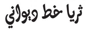
#T7Typeface: Thuraya Regular
Typeface Designer: Kristyan Sarkis, Beirut, Lebanon
Languages: Arabic
Designer’s Concept:
Thuraya is an Arabic display typeface that explores a contemporary context for the complex Diwani style with maximized calligraph- ic features. The research focused on the meeting point between calligraphy and type within a digital type environment and questioned the possibility of compromises on one account or the other. The completely curved baseline, the horizontally slanted letters, and the extended character set including ligatures and alternates, which are crucial for a harmonious calligraphic flow, are characteristics that define Thuraya. It is mainly intended for lettering purposes, headlines, logotypes, and short texts. ]]>
 #T8
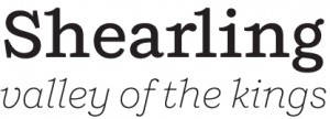
#T8Typeface: Shift
Typeface Designer: Jeremy Mickel, Providence, Rhode Island
Foundry: Mickel Design
URL: http://www.mickeldesign.com/
Members of Typeface Family/System:
Extralight, Extralight Italic, Light, Light Italic, Book, Book Italic, Medium, Medium Italic, Bold, Bold Italic, Black, and Black Italic
Designer’s Concept:
Shift is inspired by American slab-serifs from the late 19th century. In its lighter weights, it takes on the personality of a typewriter face, with flared terminals and prominent serifs. In the heavier weights, it acts as a titling Egyptian, with thin spaces between charac- ters and small counters. Designed as a display face, it also works well for text. ]]>
 #T9
#T9Typeface: Supra Sans
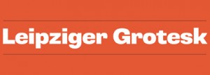
Typeface Designer: Hannes von Döhren, Berlin, Germany
Foundry: HVD Fonts
Members of Typeface Family/System:
Light, Light Italic, Light Oblique, Regular, Regular Italic, Regular Oblique, Medium, Medium Italic, Medium Oblique, Bold, Bold Italic, Bold Oblique, Heavy, Heavy Italic, Heavy Oblique, Black, Black Italic, Black Oblique, Condensed Light, Condensed Light Italic, Condensed Light Oblique, Condensed Regular, Condensed Regular Italic, Condensed Regular Oblique, Condensed Medium, Condensed Medium Italic, Condensed Medium Oblique, Condensed Bold, Condensed Bold Italic, Condensed Bold Oblique, Con- densed Heavy, Condensed Heavy Italic, Condensed Heavy Oblique, Condensed Black, Condensed Black Italic, Condensed Black Oblique
Designer’s Concept:
Supria SansTM is an extended family of 36 fonts designed by Hannes von Döhren. It contains two widths, six weights, and three styles, including the curvy, feminine Italic as well as the more conventional Oblique. Although it is inspired by the utilitarian clarity of Swiss type design, subtle curves and fine detailing impart a more playful character to the whole Supria Sans family.
Supria SansTM Condensed is the second component of the Supria type system. Encompassing the same six weights and three styles as Supria Sans, and characterized by the same approach to the modernist source material, this condensed set of fonts is 20% narrower than the normal version, allowing for significant space saving economies. Used together, Supria Sans and Supria Sans Condensed become much more than just a versatile and functional workhorse – ideal for resolving complex design issues with elegance and sophistication. ]]>
#T10
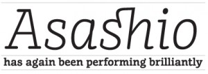
Typeface: FF Suhmo
Typeface Designer: Alex Rütten, Berlin, Germany
Foundry: FSI FontShop International
Members of Typeface Family/System: Regular, Regular Italic, Light, Light Italic, Bold, Bold Italic, Black, and Black Italic
Designer’s Concept:
Suhmo is inspired by classic Egyptian and typewriter fonts such as Courier and American Typewriter, which feature headline and text use. This impressive duality was a guideline for the concept. At the same time, many formal details were derived from the typical neon – lettering you can find on aged Italian restaurants in Germany. Suhmo has short ascenders and descenders and a generous x- height, making it a good choice for editorial design. It combines simplicity and functionality with playfulness, offering interesting de- tails such as loops and swashes and a slight stroke contrast. Its varied details are unobtrusive in text sizes while developing character and sparkle in headlines. Suhmo’s extensive character set includes numerous special characters and ligatures, several figure sets, and small caps throughout all styles. The Suhmo family consists of four weights: Light, Regular, Bold, and Black, each with an Italic. The weights were staggered to complement each other within a layout, the Black corresponding to the Regular and the Light correspond- ing to the Bold weight, allowing words or phrases to be clearly stressed within a text. The Italics are lighter than the Roman and have a relatively slight angle of slope. The forms are derived from a manual writing process and often cross the base-line or the x-height.

#T11
Typeface: News
Typeface Designer: Aki Toyoshima, New York
Foundry: FONT1000
Language: Japanese
Members of Typeface Family/System: Regular, Light, Medium, and Bold
Designer’s Concept:
This font conveys a more joyful expression that I really want to tell. ]]>
 #T12
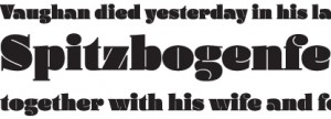
#T12Typeface: Daisy
Typeface Designer: Ludwig Übele, Berlin, Germany
URL: www.ludwiguebele.de
Members of Typeface Family/System: Regular and Italic
Designer’s Concept:
Daisy started with the lowercase c. I liked the idea that the counter consisted only of a thin line, which basically defines the drop shaped terminal. Most extreme heavy typefaces are sans serifs without any contrast. But would it also be possible to create an extreme fat typeface based on classic old face letterforms?
Since the counter forms are fixed by the thin line, other factors like line thickness and letter width must be more flexible in order to create a harmonious alphabet. Ligatures and alternates expand the typographic possibilities. ]]>
 #T14
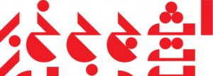
#T14Typeface: Tabati
Typeface Designer: Lara Assouad Khoury, Beirut, Lebanon
Client: Dar Onboz Publishing
Languages: Arabic
Designer’s Concept:
Tabati started with the story of a little red ball and its escapades in a world populated by circular sh, triangular trees, rectangular buses, and square rocks. It is an experiment in abstraction, simplicity, and legibility. Tabati presents an alternative reading of the Arabic alphabet through the basic geometric shapes or masses it defines rather than the lines it traces on paper. ]]>
 #T15
#T15
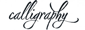
Typeface: Nori
Typeface Designer: Neil Summerour, Jefferson, Georgia
Foundry: Positype
Designer’s Concept:
Nori is a hand-lettered typeface that contains over 1,100 glyphs, 250 ligatures, 487 alternate characters,125+ swash and titling alter- nates, lining and old style numerals. I do not use digital textures. It is the result of brush and ink on paper. The textures produced in each glyph are real and the imperfections are intentional and add to the sincerity of the letters.
To view the words and sentences formed by this typeface is to look at how my hand makes letters. The fluidity, as well as the irregu- larity, is human, honest and intentional. To do so lets the brush I am holding breathe life into each letter. Once digital, any number of points and repetitive processes can’t mask its influences – and I like that.
#T17
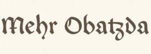
Typeface: Enzian
Typeface Designers: Jason Mannix and Lindsay Mannix, Washington, D.C.
Design Firm: Polygraph
Mentor: Photo-Lettering, Inc. / House Industries
URLs: www.polygraphcreative.com and www.myfonts.com
Members of Typeface Family/System: Regular (with small caps), Bold (with small caps), and Unconventional Italic
Designers Concept:
Enzian is the product of a German research fellowship sponsored by the Alexander von Humboldt Foundation. We set out with two goals: to better understand the technical nuance and complicated history of German Blackletter and produce an original typeface inspired by our findings. During our research, we discovered the extraordinary collections of the libraries in Munich, Nuremberg, and Vienna, and developed a humble appreciation for the craft of calligraphy. The result is a versatile Blackletter with uncommon depth, hand-influenced letterforms, and, hopefully, a bit of charm.
 #T18
#T18Typeface: Elegy
Typeface Designer: Jim Wasco, Redwood City, California
Foundry: Monotype Imaging, Woburn, Massachusetts
URL: www.fonts.com
Designer’s Concept:
Elegy was the most difficult design job I’ve ever done in my life. Since its release August 2010, Elegy has been very well received. It is based on the original ITC logo designed by Ed Benguiat in 1970. The typeface is modeled after American Spencerian Script styles of penmanship developed by Platt Rogers Spencer in the early nineteenth century done with a pointed spring steel pen nib. The type- face has a modern look to it utilizing drop caps, flourishes and details Benguiat incorporated in the original logo. Because of its fine qualities, recommended usage is at display sizes of 24 point and above. The design would be a perfect fit for printed invitations, logo- types, signage, packaging, and any other application where an elegant and unique Round Hand Script is desired. OpenType support has been added for old style figures, arbitrary fractions, proportional numbers, tabular numbers, discretionary ligatures and contextual alternates. For the features of the typeface to work correctly, Elegy must be used in an OpenType savvy page layout application,such as Adobe InDesign. ]]>
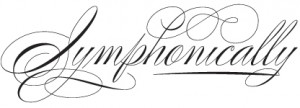
#T19
Typeface: Poem
Typeface Designer: Alejandro Paul, Buenos Aires, Argentina
Foundry: Sudtipos
Designer’s Concept:
Poem Script is a mixed collection of interpretations conjuring a late nineteenth century American pen script style. Though not an ac- tual Italian letterform, this style was called Italian Alphabet, stemming from an old penman’s term for an alphabet where the stress or shades are opposite their normal placement.
The American variant followed from the late eighteenth century British hand also confusingly called Italian Hand, which itself evolved from some seventeenth century French Batarde scripts.
It showcases the phenomenal control and mastery of hand skills required to create such ornamental and lively letters centuries ago. Producing the shaded strokes in these reversed positions required holding the pen in a position horizontal to the baseline, or the let- terforms would have to be written backwards or by rotating the paper at peculiar and extreme angles to achieve the effect.
Exotic, elaborate, and very attractive, Poem Script contains plenty of variations on each letter and comes with hundreds of calligraphic ornaments. ]]>
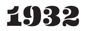
#T20
Typeface: Eames Poster Numerals
Typeface Designer: Erik van Blokland, The Hague, Netherlands
Foundry: House Industries, Yorklyn, Delaware
Designer’s Concept:
The Eames Poster Numerals are numerological necessities punctuated with a pulchritudinous parade of pachydermic power whose circusized woodcut-inspired shapes were drawn in three stackable weights and boast a broad range of color choices limited only by the imagination, RGB or CMYK spectra, and the availability of custom pigmented emulsions.
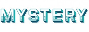
#T16
Typeface: Eventide
Typeface Designer: Jeremy Mickel, Providence, Rhode Island
Art Directors: Ken Barber and Christian Schwartz
Foundry: Photo-Lettering, Inc. / House Industries
URL: http://wwwphotolettering.com/
Members of Typeface Family/System
Banner, Diagonal, Dots, Fill, Highlight, Horizontal, Vertical, and Stroke
Designer’s Concept:
Originally designed by Paul Carlyle in the early 1940s, Eventide was added to the Photo-Lettering, Inc., film library in 1971 as a single-layer caps-only style. House Industries’ philosophy for the new Photo-Lettering service is to reinterpret the original designs, making them more useful for contemporary designers. We reimagined the alphabet to work in eight layers that can be combined or used independently, and expanded the character set to include a lowercase, punctuation, symbols, and a full complement of Central European accented characters.
Art Direction: Stefan Sagmeister
Agency Creative Direction: John Merrifield
Agency Producer: Shareen Thumbo
Production Company: Passion Pictures
Agency: TBWA Asia Pacific
Studio: Sagmeister Inc.
Client: Standard Chartered
Principal Type: custom
Dimensions: (#187) ]]>