Art Direction: Stefan Sagmeister
Studio: Sagmeister Inc.
Principal Type: custom (#40) ]]>
Client: 826DC
Principal Type: Bickham Script, Univers and Walbaum
Dimensions: 18 x 24 in. (45.7 x 61 cm) (#18) ]]>
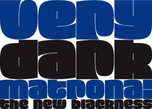
#T13
Typeface: Matrona
Typeface Designer: Hubert Jocham, Lautrach, Germany
Foundry: Hubert Jocham Type
URL: http://www.hubertjocham.de/
Designer’s Concept:
When letterpress started with the Gutenberg Bible, the typeface was like a texture. Before humanism, type did not really need to be legible. The letters were rather drawn in an ornamental way. It filled a space. My idea for Matrona was to create a similar structure. I wanted it to be very bold and still as legible as possible. The result was a headline typeface that can fill spaces. You can even fill it with a picture. Or you create an ornament with contents. There are three weights to extend the usage to different sizes. ]]>
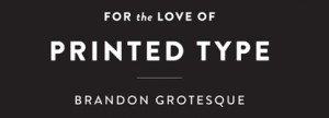
#T1
Typeface: Brandon Grotesque
Typeface Designer: Hannes von Döhren, Berlin, Germany
Foundry: HVD Fonts
Members of Typeface Family/System:
Thin, Thin Italic, Light, Light Italic, Regular, Regular Italic, Medium, Medium Italic, Bold, Bold Italic, Black, Black Italic
Designer’s Concept:
My father gave me some magazines from the 1920s and 1930s, which he had found at my grandfather’s; he thought I should have a look at the hand-lettered advertisements. I was fascinated by the surface feel and by the general atmosphere of these magazines; the way the body type was set and the various combinations of typefaces and hand-lettered headlines.
I absolutely wanted to create a typeface with that kind of feel. A geometric face that nonetheless would possess a certain softness and warmth. Because of “bad” printing, the text faces in those magazines had slightly rounded corners, lending them an emotionality that today’s clean-cut type lacks. So I decided to give Brandon slightly rounded-off corners to allow it to radiate warmth in spite of its geometric clarity. Although Brandon with its 12 styles is a relatively large family, each weight has its own aesthetic, for while the weights are based on each other they were all drawn separately in order to give each variety its own details — like the various ‘g’ variations or the perfectly round counters in the Black weight. A real italic was designed to provide additional individuality and to distinguish the font from most other geometric sans faces, making it even more ‘human’. ]]>
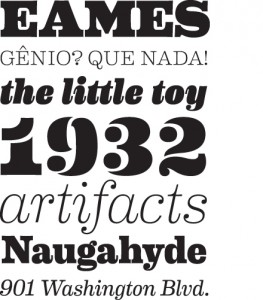 #T2
#T2Typeface: Eames Century Modern
Typeface Designer: Erik van Blokland, The Hague, Netherlands
Foundry: House Industries, Yorklyn, Delaware
Members of Typeface Family/System:
Regular, Regular Italic, Book, Book Italic, Light, Light Italic, Thin, Thin Italic, Medium, Medium Italic, Bold, Bold Italic, Extra Bold, Extra Bold Italic, Black, Black Italic, Stencil, and Stencil Cameo
Designer’s Concept:
Charles and Ray Eames did not design a typeface and this project was not about creating fonts that they would have drawn had they felt the need or inspiration to do so. It was about creating a tool that had the same universal appeal as monuments to the Eames aes- thetic, many of which have been so ingrained in our visual landscape that we barely notice them. Eames Century Modern is crafted in the same vein; its dignified legibility effectively transmits the message without overpowering the medium while devilishly intoxi- cating details in words, letters, serifs, spaces, stems and tapers find their way into the subconscious of even the most casual observer. Much like waiting in a departure lounge on Eames system airport seating; you don’t know why you’re comfortable, you just are. ]]>
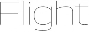
#T3
Typeface: Aero
Typeface Designers: Chester Jenkins and Jeremy Mickel, Brooklyn, New York, and Providence, Rhode Island
Foundry: Village Type and Design
URLs: http://www.vllg.com/
Members of Typeface Family/System:
Fine, Fine Italic, Thin, Thin Italic, Extralight, Extralight Italic, Light, Light Italic, Book, Book Italic, Medium, Medium Italic, Bold, Bold Italic, Heavy, Heavy Italic, Super, and Super Italic
Designers’s Concept:
Aero takes inspiration from Roger Excoffon’s landmark design Antique Olive, particularly the heavy “Nord” weight. Instead of revis- iting the original, Aero was drawn from memories of Antique Olive: its high-waist and reversed contrast. And that wonderful scooped lowercase i. The result is a contemporary reflection of a 60s-era classic, with the volume turned up and applied to a wider weight range. ]]>

#T4
Typeface: Palatino Sans Arabic
Typeface Designer: Nadine Chahine, Bad Homburg, Germany
Foundry: Linotype GmbH
Language: Arabic
Designer’s Concept:
The Palatino® Sans Arabic typeface family is a collaboration between Lebanese designer Nadine Chahine and Prof. Hermann Zapf. The design is based on classical Naskh structures and proportions, and with a hint of Thuluth. The forms, though, are treated as if written with a pen, rather than a reed. This results in curves that are soft, round, and friendly. It is designed for use in print, and brings into Arabic the informal and friendly appearance of Palatino Sans. The counters are wide open to allow for better readability in small sizes as well as to maintain an open and friendly appearance. Because of its classical reference, Palatino Sans Arabic is also well suited for setting spoken Arabic as well as children’s books. ]]>

#T5
Typeface: Tundra
Typeface Designer: Ludwig Übele, Berlin, Germany
Foundry: FontFont
Members of Typeface Family/System:
Regular, Regular Italic, Light, Light Italic, Extralight, Extralight Italic, Medium, Medium Italic, Demibold, Demibold Italic, Bold and Bold Italic
Designer’s Concept:
Tundra is a narrow running typeface with warm, curvaceous letterforms. To avoid a fence-effect caused by the narrowness. Tundra emphasizes the horizontal line with strong serifs and flat shoulders. The bold and open terminals help also to guide the eye along the line and therefore ease the reading. Tundra contains a big set of characters and comes in six weights from Extralight to Bold. ]]>

#T6
Typeface: Amalta
Typeface Designer: Vera Evstafieva, Moscow
Foundry: Infonta
URL: www.myfonts.com
Languages: Latin and Cyrillic
Designer’s Concept:
Amalta is a Display typeface with calligraphic background. It inherits weight and letter constructions from the original brush let- tering. Amalta’s Latin and Cyrillic sets were designed simultaneously with an equal attention to details and overall pattern. They both include initial and final swash forms, which can be used as a typographer chooses. Amalta is suitable for large size typesetting headlines, few-line texts, etc.
 #T7
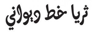
#T7Typeface: Thuraya Regular
Typeface Designer: Kristyan Sarkis, Beirut, Lebanon
Languages: Arabic
Designer’s Concept:
Thuraya is an Arabic display typeface that explores a contemporary context for the complex Diwani style with maximized calligraph- ic features. The research focused on the meeting point between calligraphy and type within a digital type environment and questioned the possibility of compromises on one account or the other. The completely curved baseline, the horizontally slanted letters, and the extended character set including ligatures and alternates, which are crucial for a harmonious calligraphic flow, are characteristics that define Thuraya. It is mainly intended for lettering purposes, headlines, logotypes, and short texts. ]]>
 #T8
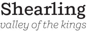
#T8Typeface: Shift
Typeface Designer: Jeremy Mickel, Providence, Rhode Island
Foundry: Mickel Design
URL: http://www.mickeldesign.com/
Members of Typeface Family/System:
Extralight, Extralight Italic, Light, Light Italic, Book, Book Italic, Medium, Medium Italic, Bold, Bold Italic, Black, and Black Italic
Designer’s Concept:
Shift is inspired by American slab-serifs from the late 19th century. In its lighter weights, it takes on the personality of a typewriter face, with flared terminals and prominent serifs. In the heavier weights, it acts as a titling Egyptian, with thin spaces between charac- ters and small counters. Designed as a display face, it also works well for text. ]]>
 #T9
#T9Typeface: Supra Sans
Typeface Designer: Hannes von Döhren, Berlin, Germany
Foundry: HVD Fonts
Members of Typeface Family/System:
Light, Light Italic, Light Oblique, Regular, Regular Italic, Regular Oblique, Medium, Medium Italic, Medium Oblique, Bold, Bold Italic, Bold Oblique, Heavy, Heavy Italic, Heavy Oblique, Black, Black Italic, Black Oblique, Condensed Light, Condensed Light Italic, Condensed Light Oblique, Condensed Regular, Condensed Regular Italic, Condensed Regular Oblique, Condensed Medium, Condensed Medium Italic, Condensed Medium Oblique, Condensed Bold, Condensed Bold Italic, Condensed Bold Oblique, Con- densed Heavy, Condensed Heavy Italic, Condensed Heavy Oblique, Condensed Black, Condensed Black Italic, Condensed Black Oblique
Designer’s Concept:
Supria SansTM is an extended family of 36 fonts designed by Hannes von Döhren. It contains two widths, six weights, and three styles, including the curvy, feminine Italic as well as the more conventional Oblique. Although it is inspired by the utilitarian clarity of Swiss type design, subtle curves and fine detailing impart a more playful character to the whole Supria Sans family.
Supria SansTM Condensed is the second component of the Supria type system. Encompassing the same six weights and three styles as Supria Sans, and characterized by the same approach to the modernist source material, this condensed set of fonts is 20% narrower than the normal version, allowing for significant space saving economies. Used together, Supria Sans and Supria Sans Condensed become much more than just a versatile and functional workhorse – ideal for resolving complex design issues with elegance and sophistication. ]]>
#T10
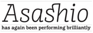
Typeface: FF Suhmo
Typeface Designer: Alex Rütten, Berlin, Germany
Foundry: FSI FontShop International
Members of Typeface Family/System: Regular, Regular Italic, Light, Light Italic, Bold, Bold Italic, Black, and Black Italic
Designer’s Concept:
Suhmo is inspired by classic Egyptian and typewriter fonts such as Courier and American Typewriter, which feature headline and text use. This impressive duality was a guideline for the concept. At the same time, many formal details were derived from the typical neon – lettering you can find on aged Italian restaurants in Germany. Suhmo has short ascenders and descenders and a generous x- height, making it a good choice for editorial design. It combines simplicity and functionality with playfulness, offering interesting de- tails such as loops and swashes and a slight stroke contrast. Its varied details are unobtrusive in text sizes while developing character and sparkle in headlines. Suhmo’s extensive character set includes numerous special characters and ligatures, several figure sets, and small caps throughout all styles. The Suhmo family consists of four weights: Light, Regular, Bold, and Black, each with an Italic. The weights were staggered to complement each other within a layout, the Black corresponding to the Regular and the Light correspond- ing to the Bold weight, allowing words or phrases to be clearly stressed within a text. The Italics are lighter than the Roman and have a relatively slight angle of slope. The forms are derived from a manual writing process and often cross the base-line or the x-height.

#T11
Typeface: News
Typeface Designer: Aki Toyoshima, New York
Foundry: FONT1000
Language: Japanese
Members of Typeface Family/System: Regular, Light, Medium, and Bold
Designer’s Concept:
This font conveys a more joyful expression that I really want to tell. ]]>
 #T12
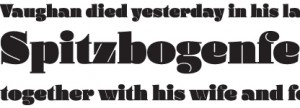
#T12Typeface: Daisy
Typeface Designer: Ludwig Übele, Berlin, Germany
URL: www.ludwiguebele.de
Members of Typeface Family/System: Regular and Italic
Designer’s Concept:
Daisy started with the lowercase c. I liked the idea that the counter consisted only of a thin line, which basically defines the drop shaped terminal. Most extreme heavy typefaces are sans serifs without any contrast. But would it also be possible to create an extreme fat typeface based on classic old face letterforms?
Since the counter forms are fixed by the thin line, other factors like line thickness and letter width must be more flexible in order to create a harmonious alphabet. Ligatures and alternates expand the typographic possibilities. ]]>
 #T14
#T14Typeface: Tabati
Typeface Designer: Lara Assouad Khoury, Beirut, Lebanon
Client: Dar Onboz Publishing
Languages: Arabic
Designer’s Concept:
Tabati started with the story of a little red ball and its escapades in a world populated by circular sh, triangular trees, rectangular buses, and square rocks. It is an experiment in abstraction, simplicity, and legibility. Tabati presents an alternative reading of the Arabic alphabet through the basic geometric shapes or masses it defines rather than the lines it traces on paper. ]]>
 #T15
#T15
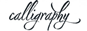
Typeface: Nori
Typeface Designer: Neil Summerour, Jefferson, Georgia
Foundry: Positype
Designer’s Concept:
Nori is a hand-lettered typeface that contains over 1,100 glyphs, 250 ligatures, 487 alternate characters,125+ swash and titling alter- nates, lining and old style numerals. I do not use digital textures. It is the result of brush and ink on paper. The textures produced in each glyph are real and the imperfections are intentional and add to the sincerity of the letters.
To view the words and sentences formed by this typeface is to look at how my hand makes letters. The fluidity, as well as the irregu- larity, is human, honest and intentional. To do so lets the brush I am holding breathe life into each letter. Once digital, any number of points and repetitive processes can’t mask its influences – and I like that.
#T17
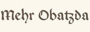
Typeface: Enzian
Typeface Designers: Jason Mannix and Lindsay Mannix, Washington, D.C.
Design Firm: Polygraph
Mentor: Photo-Lettering, Inc. / House Industries
URLs: www.polygraphcreative.com and www.myfonts.com
Members of Typeface Family/System: Regular (with small caps), Bold (with small caps), and Unconventional Italic
Designers Concept:
Enzian is the product of a German research fellowship sponsored by the Alexander von Humboldt Foundation. We set out with two goals: to better understand the technical nuance and complicated history of German Blackletter and produce an original typeface inspired by our findings. During our research, we discovered the extraordinary collections of the libraries in Munich, Nuremberg, and Vienna, and developed a humble appreciation for the craft of calligraphy. The result is a versatile Blackletter with uncommon depth, hand-influenced letterforms, and, hopefully, a bit of charm.
 #T18
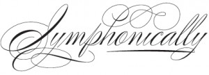
#T18Typeface: Elegy
Typeface Designer: Jim Wasco, Redwood City, California
Foundry: Monotype Imaging, Woburn, Massachusetts
URL: www.fonts.com
Designer’s Concept:
Elegy was the most difficult design job I’ve ever done in my life. Since its release August 2010, Elegy has been very well received. It is based on the original ITC logo designed by Ed Benguiat in 1970. The typeface is modeled after American Spencerian Script styles of penmanship developed by Platt Rogers Spencer in the early nineteenth century done with a pointed spring steel pen nib. The type- face has a modern look to it utilizing drop caps, flourishes and details Benguiat incorporated in the original logo. Because of its fine qualities, recommended usage is at display sizes of 24 point and above. The design would be a perfect fit for printed invitations, logo- types, signage, packaging, and any other application where an elegant and unique Round Hand Script is desired. OpenType support has been added for old style figures, arbitrary fractions, proportional numbers, tabular numbers, discretionary ligatures and contextual alternates. For the features of the typeface to work correctly, Elegy must be used in an OpenType savvy page layout application,such as Adobe InDesign. ]]>
#T19
Typeface: Poem
Typeface Designer: Alejandro Paul, Buenos Aires, Argentina
Foundry: Sudtipos
Designer’s Concept:
Poem Script is a mixed collection of interpretations conjuring a late nineteenth century American pen script style. Though not an ac- tual Italian letterform, this style was called Italian Alphabet, stemming from an old penman’s term for an alphabet where the stress or shades are opposite their normal placement.
The American variant followed from the late eighteenth century British hand also confusingly called Italian Hand, which itself evolved from some seventeenth century French Batarde scripts.
It showcases the phenomenal control and mastery of hand skills required to create such ornamental and lively letters centuries ago. Producing the shaded strokes in these reversed positions required holding the pen in a position horizontal to the baseline, or the let- terforms would have to be written backwards or by rotating the paper at peculiar and extreme angles to achieve the effect.
Exotic, elaborate, and very attractive, Poem Script contains plenty of variations on each letter and comes with hundreds of calligraphic ornaments. ]]>
#T20
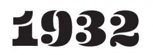
Typeface: Eames Poster Numerals
Typeface Designer: Erik van Blokland, The Hague, Netherlands
Foundry: House Industries, Yorklyn, Delaware
Designer’s Concept:
The Eames Poster Numerals are numerological necessities punctuated with a pulchritudinous parade of pachydermic power whose circusized woodcut-inspired shapes were drawn in three stackable weights and boast a broad range of color choices limited only by the imagination, RGB or CMYK spectra, and the availability of custom pigmented emulsions.

#T16
Typeface: Eventide
Typeface Designer: Jeremy Mickel, Providence, Rhode Island
Art Directors: Ken Barber and Christian Schwartz
Foundry: Photo-Lettering, Inc. / House Industries
URL: http://wwwphotolettering.com/
Members of Typeface Family/System
Banner, Diagonal, Dots, Fill, Highlight, Horizontal, Vertical, and Stroke
Designer’s Concept:
Originally designed by Paul Carlyle in the early 1940s, Eventide was added to the Photo-Lettering, Inc., film library in 1971 as a single-layer caps-only style. House Industries’ philosophy for the new Photo-Lettering service is to reinterpret the original designs, making them more useful for contemporary designers. We reimagined the alphabet to work in eight layers that can be combined or used independently, and expanded the character set to include a lowercase, punctuation, symbols, and a full complement of Central European accented characters.
Creative Direction: Lisa Strausfeld
Designer/Developer: Adam Suharja
Design Office: Pentagram Design New York
Client: GE
Principal Type: GE Inspira
Dimensions: (#208) ]]>
School: Maryland Institute College of Art
Instructor: Brockett Horne
Principal Type: custom
Dimensions: (#207) ]]>
Creative Direction: Vanessa Marzaroli
Creatives: Tom Phillips and Jason Swinscoe, New York
Calligraphy: Bill Kemp
Illustration: Daniel Chang, Lynn Cho, Vanessa Marzaroli, Chris ONeill, and Michael Relth
Executive Producer: Dave Kleinman
Producer: Carrie Schupper
Post Producer: Dana Vaden
2D Animation: Daniel Chang, Jiaren Hui, Vanessa Marzaroli , Chris ONeill, Michael Relth, Maithy Tran, and Lawrence Wyatt
Storyboard: Artist Vincent Lucido
Music: The Cinematic Orchestra: Jason Swinscoe
Production: Company Blind, Inc.
Agency: Exposure USA
Client: Bill Kemp
Principal Type: handlettering
Dimensions: (#206) ]]>
Design Office: Pentagram Design New York
Client. The New York Times Magazine
Principal Type: National Regular
Dimensions: (#205) ]]>
School: School of Visual Arts, New York
Thesis Advisor: Paula Scher
Principal Type: ITC Cheltenham and Walbaum
Dimensions: (#204) ]]>
School: School of Visual Arts, New York
Principal Type: handlettering
Dimensions: (#203) ]]>
 Design: Elliott Walker, Brooklyn, New York
School: School of Visual Arts, New York
Instructor: Gail Anderson
Principal Type: handlettering
Dimensions: (#202) ]]>
 Design: Knut Maierhofer, München, Germany
Motion Design: Gabriel Weiss
Expert Motion Design: Cecil Rustemeyer
Music: Christian Ring
Client Manager: Nadine Vicentini
Brand Company: KMS TEAM GmbH
Client: Amsterdam Molecular Therapeutics (AMT)
Principal Type: Univers
Dimensions: (#201) ]]>
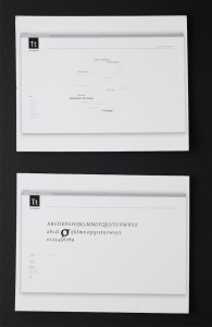 Design: Niko Skourtis, New York
School: California College of the Arts, San Francisco
Instructors: Dennis Crowe and Michael Vanderbyl
Principal Type: Helvetica
Dimensions: (#200) ]]>
 Design: Jesse Senje Yuan, Rego Park, New York
Song: Ibuki by the Yoshida Brothers
School: School of Visual Arts, New York
Instructor Gail Anderson
Principal Type: Li Song Pro
Dimensions: (#199) ]]>
 Design Office: UnderConsideration, Austin, Texas
Principal Type: Coquette, Skolar Web, and P22 Underground
Dimensions: (#198) ]]>
School: School of Visual Arts, New York
Instructor: Ori Kleiner
Principal Type: Baskerville, Bodoni, Futura, Garamond, and Optima
Dimensions: various (#197) ]]>
School: School of Visual Arts, New York
Instructor: Gail Anderson
Principal Type: Baskerville, Futura, Gold Rush Regular, and Ivy League
Dimensions: various (#196) ]]>
School: School of Visual Arts, New York
Instructor: Gail Anderson
Principal Type various
Dimensions: various (#195) ]]>
School: School of Visual Arts, New York
Instructors: Gail Anderson and Stefan Sagmeister
Principal Type: Custom
Dimensions: various (#193) (#194) ]]>
 Design: Elisa Bates, Brooklyn, New York
School: School of Visual Arts, New York
Instructor: Gail Anderson
Principal Type: various scanned wood type
Dimensions: various (#191) (#192) ]]>
Creative Direction: Jae Woo Lee
Agency: Markers
Principal Type: custom
Dimensions: various (#190) ]]>
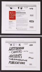 Design: Samuel Jacques, Montréal
Creative Direction: Philippe Lamarre
Lettering: Samuel Jacques
Agency: TOXA
Client: Nouveau Théâtre Expérimental
Principal Type: handlettering
Dimensions: various (#189) ]]>
Art Direction: Kyle Miller
Creative Direction: Scott Matz, Justin Meredith
Lettering: Kyle Miller
Animation: Ken Krueger and Kyle Miller
Music and Sound Design: Michael Montes
Design Office: Thornberg & Forester
Client: GEL Conference 2010
Principal Type: handlettering
Dimensions: (#188) ]]>
Art Direction: Stefan Sagmeister
Agency Creative Direction: John Merrifield
Agency Producer: Shareen Thumbo
Production Company: Passion Pictures
Agency: TBWA Asia Pacific
Studio: Sagmeister Inc.
Client: Standard Chartered
Principal Type: custom
Dimensions: (#187) ]]>
Concept: Fern Berresford
Typographer: Andy Dymock
Production: Company Coy! Communications
Client: A Large Evil Corporation
Principal Type: Franklin Gothic Wide
Dimensions: (#186) ]]>
Art Direction: Hiroaki Nagai
Photography: Shinichi Kaneko
Copywriter: Tadayasu Seto
Design Office: N.G.Inc.
Client: Shinich Kaneko
Principal Type: custom
Dimensions: 40.6 x 57.3 in. (103 × 145.6 cm) (#185) ]]>
Art Direction: Tomoya Kaishi
Design Office: room-composite
Principal Type: Chu Gothic BBB and Yokobuto Mincho
Dimensions: 28.7 x 40.6 in. (72.8 x 103 cm) (#184) ]]>
Studio: Atelier Bundi AG
Client: Theater Biel Solothurn
Principal Type: Helvetica Neue and custom
Dimensions: 35.2 x 50.4 in. (89.5 x 128 cm) (#183) ]]>
Design Office: MAGMA Brand Design GmbH & Co. KG
Client: Vitra Design Museum
Principal Type: Akkurat
Dimensions: 23.4 x 33.1 in. (59.4 x 84.1 cm) (#182) ]]>
 Art Direction: Christian Doering, Hamburg, Germany
Creative Direction: Katrin Oeding
Copywriter: Till Grabsch
Graphic Designer: Ana Magalhaes
Agency: Kolle Rebbe/KOREFE
Client: T.D.G. Vertriebs UG (haftungsbeschraenkt) & Co. KG
Principal Type: ANA
Dimensions: various (#181) ]]>
Writer: Andy Mathieson
Design Office: This is Real Art
Principal Type: OCR B
Dimensions: 16.5 x 23.4 in. (42 x 59.4 cm) (#180) ]]>
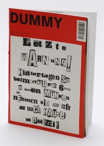 Design: Benjamin Schulte and Bjoern Wolf, Berlin and Düsseldorf, Germany
Art Direction: Benjamin Schulte and Bjoern Wolf
Creative Direction: Benjamin Schulte and Bjoern Wolf
Lettering: Benjamin Schulte and Bjoern Wolf
Client: Dummy Verlag
Principal Type: Akzidenz Grotesk, Amerigo, Arnhem, and handlettering
Dimensions: 7.7 x 10.8 in. (19.5 x 27.5 cm) (#179) ]]>
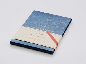 Art Direction: Daria Reina, Rome, Italy
Creative Direction: Andrea Ferolla and Daria Reina
Illustration: Andrea Ferolla
Design Office: Ferolla Reina – Chez Dede
Principal Type: Commercial Script, FF Din, Engravers Gothic, Maus, and Rosewood
Dimensions: 4.3 x 6.3 in. (11 x 16 cm) (#178) ]]>
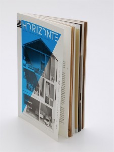 Creative Direction: Konrad Angermüller, Anna Kranebitter, Jelka Kretzschmar, and Adrian Palko, Weimar, Germany
Client: HORIZONTE – Zeitschrift für Architekturdiskurs
Principal Type: Korpus, Liberation Mono, and SangBleu BP
Dimensions: 5.9 x 9.1 in. (15 x 23 cm) (#177) ]]>
Client: Richelle Singleton & Ken Rothermich
Principal Type: Avenir, Sackers Gothic, and Shelly
Dimensions: various (#176) ]]>
Art Direction: Pepe Gimeno
Studio: Pepe Gimeno · Proyecto Gráfico
Client: Universitat de València
Principal Type: Akzidenz Grotesk
Dimensions: 19.7 x 27.6 in. (50 x 70 cm) (#175) ]]>
Executive Creative Direction: Jim Walls
Chief Creative Officer: Principle Darryl Cilli
Creative Direction: Dan Shepelavy
Copywriter: Anna Hartley
Director of Production: Rosemary Fahmie
Printing: Alcom Printing Company
Agency: 160over90
Client: Loyola University Maryland
Principal Type: Archer and Gotham Narrow
Dimensions: 17 x 11.5 in. (43.2 x 29.2 cm) (#174) ]]>
Creative Direction: Brian Collins and Leland Maschmeyer
Design Office: COLLINS:
Client: Lenovo
Principal Type: Compressed Key
Dimensions: 14 x 20 in. (35.6 x 50.8 cm) (#173) ]]>
Final Art Work: Silke Hensel, Jan Kiesswetter, and Anna Straetmans
Design Office: MAGMA Brand Design GmbH & Co. KG
Client: E&B engelhardt & bauer
Principal Type: OUBEY Type System and Generika MG
Dimensions: 26.8 x 18.9 in. (68 x 48 cm) (#172) ]]>
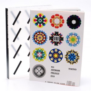 Design: Koo Bon-hae and Park Kum-jun, Seoul
Art Direction: Park Kum-jun
Creative Direction: Park Kum-jun
Illustration: Park Kum-jun and Lee Ji-hee
Photography: Park Kum-jun and Cho Ok-hee
Photo Revision: Joe Sung-kwon
Photo Studio: Studio Dahong
Writers: Lee So-youn and Song Ji-sun
Publisher: Jong Jong-in
Coordinators: Lee Ji-hye, Lee Jung-hye, and Nam Seung-youn
Design Office: 601bisang
Principal Type: Cooper Black, Garamond Pro, and SM ShinShin Myung-jo
Dimensions: 9.6 x 13.2 in (24.3 x 33.5 cm) (#171) ]]>
 Design: Belle Chock and Gloria Hiek, San Francisco
Creative Direction: Kit Hinrichs
Photography: Terry Heffernan
Illustration: Elwood Smith, Rhinebeck, NewYork
Copywriter: Delphine Hirasuna
Design Office: Studio Hinrichs
Client: Sappi Fine Paper North America
Principal Type: Champion Gothic HTF, Franklin Gothic BT, Helvetica Neue, and News Gothic BT
Dimensions: 7.5 x 10.4 in. (19.1 x 26.4 cm) (#170) ]]>
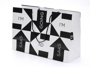 Design: Michael Bierut and Jennifer Kinon, New York
Art Direction: Michael Bierut
Design Office: Pentagram Design New York
Client: Saks Fifth Avenue
Principal Type: Gotham Light
Dimensions: various (#169) ]]>
Art Direction: Pum Lefebure
Creative Direction: Pum Lefebure and Jake Lefebure
Agency: Design Army
Client: Signature Theatre Season Posters
Principal Type: Caslon Open Face and Swiss 721
Dimensions: 14 x 22 in. (35.6 x 55.9 cm) (#168) ]]>
 Design: Cláudia de Almeida, New York
Creative Direction: Debra Bishop
Lettering: Cláudia de Almeida
Publication: MORE
Principal Type: Affair and Miller
Dimensions: 16.5 x 10.9 in. (41.9 x 27.7 cm) (#167) ]]>
Art Direction: Paul Buckley
Publisher: Penguin Group (USA)
Principal Type: Gaq and Gotham
Dimensions: 7.5 x 9.1 in. (19.1 x 23.1 cm) (#166) ]]>
Art Direction: Lizá Defossez Ramalho and Artur Rebelo
Creative Direction: Lizá Defossez Ramalho and Artur Rebelo
Client: Parque Escolar
Principal Type: Stripe
Dimensions various (#165) ]]>
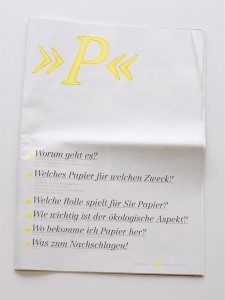 Design: Sonja Fritsch and Stephan Günther, Mainz, Germany
School: Fachhochschule Mainz
Professor: Ulysses Voelker
Principal Type: Centennial LT and Letter Gothic LT
Dimensions: 10.6 x 15 in. (27 x 38 cm) (#164) ]]>
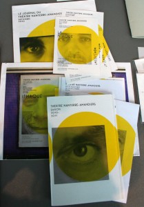
Design: Pascal Béjean, Olivier Körner, and Nicolas Ledoux, Paris
Creative Direction: Pascal Béjean, Olivier Körner, and Nicolas Ledoux
Studio: Pascal Béjean, Olivier Körner & Nicolas Ledoux
Client: Théâtre Nanterre-Amandiers
Principal Type: Marcelle and Replica
Dimensions: various (#163) ]]>
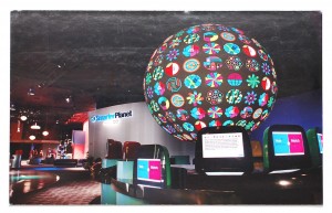 Design: Rob Alexander, Will Ecke, and Jason Schulte, Boston and San Francisco
Executive Creative Director: Tom Godici and Greg Ketchum, New York
Worldwide Executive Creative Director: Susan Westre
Art Direction: Tom Godici, Jason Schulte, and Lew Willig
Creative Direction: Michael Paterson
Vice Chairman of Creative: Chris Wall
Writers: Rob Jamieson, Greg Ketchum, and Mike Wing
Agency: Ogilvy & Mather, New York
Studio Office: Jason Schulte Design
Client: Ogilvy & Mather and IBM
Principal Type: ITC Lubalin
Dimensions: various (#162) ]]>
Client: Maryland Institute College of Art (MICA)
Principal Type: Century Schoolbook and custom
Dimensions: 12 x 19 in. (30.5 x 48.3 cm) (#161) ]]>
Art Direction: Christoph Sauter and Mara Weyel
Creative Direction: Artur Gulbicki
Brand Consulting: Tobias Sommer
Design Office: KW Neun Grafikagentur
Client: Kulturamt der Stadt
Principal Type: Generika Mono
Dimensions: 33.1 x 46.8 in. (84.1 cm x 118.9 cm) (#160) ]]>
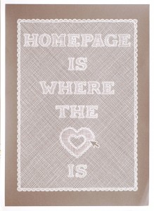 Design: Bernardo Margulis, Philadelphia
Art Direction: Kelly Holohan
Lettering: Bernardo Margulis
Copywriter: Bernardo Margulis
Principal Type: handlettering
Dimensions: 12 x 16 in. (30.5 x 40.6 cm) (#159) ]]>
 Lettering: Erik Marinovich, San Francisco
Studio: Friends of Type
Principal Type: handlettering
Dimensions: 27 x 30 in. (68.6 x 76.2 cm) (#158) ]]>
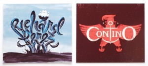 Lettering: Erik Marinovich, San Francisco
Studio: Friends of Type
Principal Type: handlettering
Dimensions various (#157) ]]>
Art Direction: Tomoya Kaishi
Studio: room-composite
Client: Contemporary Art in Tokyo
Principal Type: Fake Receipt Regular and custom
Dimensions: 2 s8.7 x 40.6 in. (72.8 x 103 cm) (#156) ]]>
Art Direction: Michael Bierut
Design Office: Pentagram Design New York
Client: Yale School of Architecture
Principal Type: News Gothic BT and Titling Gothic Compressed
Dimensions: 22 x 34 in. (55.9 x 86.4 cm) (#155) ]]>
School: Staatliche Akademie der Bildenden Künste Stuttgart
Professor: Hans-Georg Pospischi
Principal Type: handlettering
Dimensions: 23.4 x 33.1 in. (59.4 x 84.1 cm) (#154) ]]>
Art Direction: Akihiko Tsukamoto
Lettering: Akihiko Tsukamoto
Illustration: Harumi Kimura
Design Office: Zuan Club
Client: Hatter TORAYA
Principal Type: handlettering
Dimensions: 28.7 x 40.6 in. (72.8 x 103 cm) (#153) ]]>
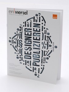 Studio: leomaria grafikdesign
Client: Alliance of German Designers (AGD)
Principal Type: Helvetica Extra Compressed, Neoprint, and Sabon
Dimensions: 9.2 x 11.8 in. (23.4 x 30 cm) (#152) ]]>
Design Office: Hesse Design GmbH
Client: Hochschule für Gestaltung Offenbach
Principal Type: GE Arista and Replica Pro Bold
Dimensions: 27.6 x 39.4 in. (70 x 100 cm) (#151) ]]>
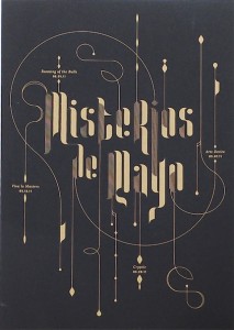 Design: Bruce Burton and Katy Fischer, St. Louis, Missouri
Creative Direction: Eric Thoelke
Studio: TOKY Branding + Design
Client: Contemporary Art Museum St. Louis
Principal Type: handlettering
Dimensions: (#150) ]]>
Studio: Sublurban
Principal Type: Akzidenz-Grotesk and Gill Sans
Dimensions: 18 x 24 in. (45.7 x 61 cm) (#149) ]]>
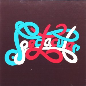 Lettering: Erik Marinovich, San Francisco
Studio: Friends of Type
Client: Graniph
Principal Type: handlettering
Dimensions: (#148) ]]>
Art Direction: Ingrid Chou
Creative Direction: Julia Hoffmann
Photography: Michael Nagle
Museum: The Museum of Modern Art (MoMA), Department of Advertising and Graphic Design
Client: Department of Education, The Museum of Modern Art (MoMA)
Principal Type: MoMA Gothic Display and custom
Dimensions: 354 x 87 ft. (107.9 x 26.5 m) (#147) ]]>
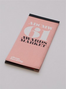 Design: Taylor Buckholz, Washington, D.C.
Art Direction: Pum Lefebure
Creative Direction: Jake Lefebure and Pum Lefebure
Writer: Wayne Geyer
Printer: Westland Enterprises, Agency Design Army
Client: Art Directors Club of Metropolitan Washington (ADCMW) Annual Show 61
Principal Type: Bodoni Poster, DIN, and Sahara Bodoni
Dimensions: various (#146) ]]>
 Design: Koshi Ogawa, Tokyo
Client: The Society of Publishing Arts
Principal Type: custom
Dimensions: 10.2 x 8.5 in. (25.8 × 21.6 cm) (#145) ]]>
Art Direction: Craig Bailey
Creative Direction: David Schimmel
Photography: Kristy Leibowitz
Studio: And Partners
Client: Smythe & Rawls
Principal Type: Forza and PNM Caecilia
Dimensions: various (#144) ]]>
 Art Direction: Drue Wagner, New York
Creative Direction: Dirk Barnett
Publication: Maxim
Principal Type: Granat
Dimensions: 15.25 x 10.5 in. (38.7 x 26.7 cm) (#143) ]]>
Creative Direction: Jennifer Kinon and Bobby C. Martin Jr.
Illustration: Joe Finocchiaro and Jasper Goodall, Brighton, UK
Agency: OCD | The Original Champions of Design
Client: Girl Scouts of the USA
Principal Type: Avenir (modified) and Omnes
Dimensions: (#142) ]]>
Client: Archer Stables
Principal Type: handlettering
Dimensions: (#141) ]]>
School: School of Visual Arts, New York
Instructor: Genevieve Williams
Principal Type: Trade Gothic
Dimensions: 11 x 15 in. (27.9 x 38.1 cm) (#140) ]]>
 Design: Rukiye Sahin, New York
School: School of Visual Arts, New York
Instructor: Paul Sahre
Principal Type: unknown
Dimensions: 11 x 15 in. (27.9 x 38.1 cm) (#139) ]]>
Design Direction: Fred Woodward
Illustration: Mark Todd
Publication: GQ
Principal Type: handlettering
Dimensions: 16 x 10.75 in. (40.6 x 27.3 cm) (#138) ]]>
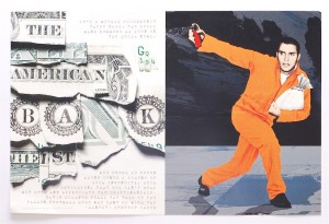 Design: Anton Ioukhnovets, New York
Design Direction: Fred Woodward
Publication: GQ
Principal Type: handlettering
Dimensions: 16 x 10.75 in. (40.6 x 27.3 cm) (#137) ]]>
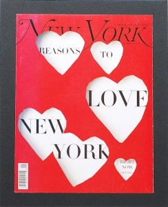 Design: John Gall, New York
Design Direction: Chris Dixon
Editor-in-chief: Adam Moss
Publication: New York Magazine
Principal Type: HTF Didot Light
Dimensions: 7.6 x 10.5 in. (19.3 x 26.7 cm) (#136) ]]>
Creative Direction: Diti Katona and John Pylypczak
Studio: Concrete Design Communications
Client: Fabbrica
Principal Type: ITC American Typewriter, Blender Pro, and custom
Dimensions various (#135) ]]>
 Design: Becky Berkheimer and Kathryn Bernadette Fabrizio, Philadelphia
Senior Design Direction: Alana McCann
Art Direction: Carolyn Keer
In-House Studio: Anthropologie
Principal Type: Akzidenz Grotesk
Dimensions various (#134) ]]>
Design Direction: Brad Stevens
Creative Direction: Jason Little
Agency: Landor Associates
Client: Iggesund
Principal Type: Arete Mono
Dimensions: 23.4 x 33.1 in. (59.4 x 84 cm) (#133) ]]>
Art Direction: Sam Eckersley
Creative Direction: Stuart Rogers
Design Office: Rogers Eckersley Design
Client: Playwrights Horizons
Principal Type: Knockout No. 70 Full Welterweight
Dimensions: 22 x 36 in. (55.9 x 91.4 cm) (#132) ]]>
Design Office: Piscatello Design Centre
Client: Fashion Institute of Technology
Principal Type: Berthold Akzidenz Grotesk
Dimensions: 23.4 x 33.1 in. (59.4 x 84.1 cm) (#131) ]]>
Lettering: Henrik Kubel
Design Office: A2/SW/HK
Client: Royal College of Art
Principal Type: Fern Italic, Fern Regular, and handlettering
Dimensions: 27.6 x 39.4 in. (70 x 100 cm) (#130) ]]>
Art Direction: Gaku Ohsugi
Creative Direction: Fumiko Shirahama
Design Office: 702 Design Works
Client: Wa ltd.
Principal Type: custom
Dimensions: 28.7 x 40.6 in. (72.8 x 103 cm) (#129) ]]>
School: School of Visual Arts, New York
Instructor: Andrew Castrucci
Principal Type: Distorted type
Dimensions: 24 x 30 in. (61 x 76.2 cm) (#128) ]]>
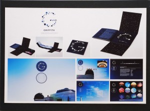 Design: Tomoko Ogino, Pasadena, California
Photography: Kai Iwamoto
School: Art Center College of Design
Instructor: Brad Bartlett
Principal Type: Gotham
Dimensions:
Posters: 40 x 11.8 in. (101.6 x 30 cm)
Calendar: 40 x 20.5 in. (101.6 x 52.1 cm) (#127) ]]>
School: Art Center College of Design
Instructor: Brad Bartlett
Principal Type: Akkurat
Dimensions: 24 x 36 in. (61 x 91.4 cm) (#126) ]]>
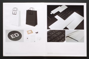 Design: Jean Tran, Montréal
School: Université du Québec à Montréal (UQÀM)
Instructor: Louis Gagnon
Principal Type: DIN (modified), Helvetica Neue (modified), and custom
Dimensions: various (#125) ]]>
School: Kookmin University Graduate School
Instructor: Chris Ro
Principal Type: various
Dimensions: 23.4 x 33.1 in. (59.4 x 84.1 cm) (#124) ]]>
School: School of Visual Arts, New York
Instructor: Carin Goldberg
Principal Type: woodtype
Dimensions: 20 x 25 in. (50.8 x 63.5 cm) (#123) ]]>
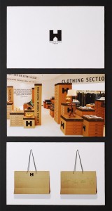 Design: Hiu Chui, Weehawken, New Jersey
School: School of Visual Arts, New York
Instructors: Kristina DiMatteo and Carin Goldberg
Principal Type: ITC Officina Sans
Dimensions: (#122) ]]>
School: Savannah College of Art and Design
Instructor: Rhonda Arntsen
Principal Type: handlettering
Dimensions: 10 x 24 in. (25.4 x 61 cm) (#121) ]]>
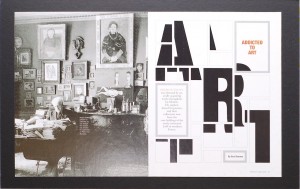 Design: Todd Albertson, Washington, D.C.
Studio: Todd Albertson Design
Client: France Magazine
Principal Type: Helvetica Neue
Dimensions: 9 x 10.9 in. (22.9 x 27.7 cm) (#120) ]]>
Design Direction: Michele Silvestri
Art Direction: Beth Hambly
Chief Creative Officer: Toby Barlow
Creative Direction: Eric McClellan
Lettering: Graham Clifford
Photography: John Roe, Farmington Hills, Michigan
Copywriter: Susan Mersch
Retoucher: Armstrong-White
Strategy: Emilie Hamer
Design Office: Graham Clifford Design, New York and Agency Team Detroit
Client: Ford Motor Company
Principal Type: Ford Antenna and handlettering
Dimensions: 8.5 x 11 in. (21.6 x 27.9 cm) (#119) ]]>
 Design: Stefan Kaetz, Hamburg
School: University of Applied Sciences, Hamburg
Professor: Heike Grebin
Principal Type: Trade Gothic
Dimensions: 10.4 x 14.8 in. (26.5 x 37.5 cm) (#118) ]]>
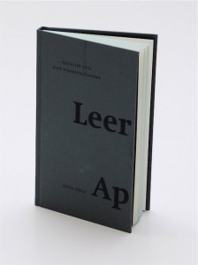 Design: Jenna Gesse, Bielefeld, Germany
School: Fachhochschule Bielefeld/Fachbereich Gestaltung
Professor: Dirk Fütterer
Principal Type: Futura and Swift
Dimensions: 4.3 x 7.1 in. (11 x 18 cm) (#117) ]]>
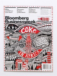 Design: Sangwon Bae, Geehyun Joo, Dajeong Kim, and Sukju Lee, Seoul
Art Direction: Jiwon Huh, Hyesoo Kim, Joonki Min, and Jisung Park
Creative Direction: Deborah Kim, Yujin Kim, and Jiyoung Lee
Lettering: Hyeran Choi, Suyeon Kim, Ryunghwa Rhee, and Chris Ro
Typographers: Haewon Ahn, Jihae Kim, Eunjung Lee, and Songeun Lee
Editors: Jin Yeol Jung and Yunim Kim
School: Better Days Institute
Instructors: Chris Ro and Jae Hyouk Sung
Principal Type: handlettering
Dimensions: 7.5 x 10 in. (19 x 25.5 cm) (#116) ]]>
School: School of Visual Arts, New York
Instructor: Paula Scher
Principal Type: custom
Dimensions various (#114) (#115) ]]>
School: University of Pennsylvania
Instructor: Etta Siegel
Principal Type: handlettering
Dimensions: 18 x 24 in. (45.7 x 61 cm) (#113) ]]>
School: School of Visual Arts, New York
Instructor: Steven Heller
Principal Type: Memoriam Pro
Dimensions: 12 x 18 in. (30.4 x 45.7 cm) (#112) ]]>
Principal Type: Franklin Gothic
Dimensions: 2 x 3.5 in. (5.1 x 8.9 cm) (#111) ]]>
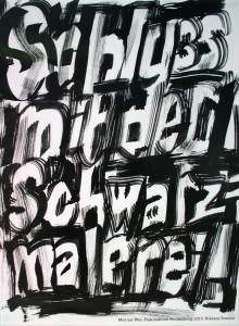
Design: Niklaus Troxler, Willisau, Switzerland
Lettering: Niklaus Troxler
Design Office: Niklaus Troxler Design
Client: Mut Zur Wut, Götz Gramlich, Heidelberg, Germany
Principal Type: handlettering
Dimensions: 33.1 x 46.9 in. (84 x 119 cm) (#110) ]]>

Design: Niklaus Troxler, Willisau, Switzerland
Lettering: Niklaus Troxler
Design Office: Niklaus Troxler Design
Client: Jazz in Willisau
Principal Type: handlettering
Dimensions: 35.4 x 50.4 in. (90 x 128 cm) (#109) ]]>
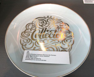
Creative Direction: Christopher Simmons, San Francisco
Lettering: Danielle Davis, Lawton, Oklahoma
Design Office: MINETM
Principal Type: handlettering
Dimensions: 8-inch (20.3-cm) diameter (#108) ]]>
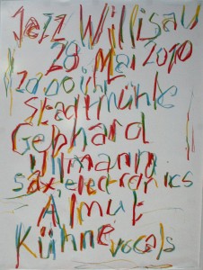
Design: Niklaus Troxler, Willisau, Switzerland
Lettering: Niklaus Troxler
Design Office: Niklaus Troxler Design
Client: Jazz in Willisau
Principal Type: handlettering
Dimensions: 35.4 x 50.4 in. (90 x 128 cm) (#107) ]]>
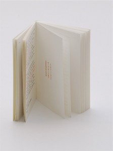 Design: Olaf Jäger and Regina Jäger, Überlingen, Germany
Agency: Jäger & Jäger
Client: Nils Holger Moormann GmbH
Principal Type: Olympia Report de Luxe electric typewriter type
Dimensions: 4.1 x 5.8 in. (10.5 x 14.8 cm) (#106) ]]>
Lettering: Justus Oehler
Design Office: Pentagram Design Berlin
Client: The Haiti Poster Project
Principal Type: handlettering
Dimensions: 17.7 x 23.6 in. (45 x 60 cm) (#105) ]]>
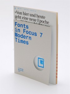 Art Direction: Flo Gaertner, Karlsruhe, Germany
Second Art Direction: Matthias Kantereit
Design Office: MAGMA Brand Design GmbH & Co. KG
Client: Linotype GmbH
Principal Type: ITC Charter, Helvetica Monospaced, and Times Modern
Dimensions: 8.1 x 11 in. (20.5 x 28 cm) (#104) ]]>
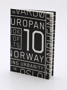 Design: Jiri Adamik-Novak, Stockholm, Sweden
Art Direction: Jiri Adamik-Novak
Client: Konstfack University Press
Principal Type: Lexicon
Dimensions: 5.4 x 9 in. (13.8 x 22.8 cm) (#103) ]]>
Client: Europan Norway
Principal Type: Blender Pro
Dimensions: 7.1 x 10.2 in. (18 x 26 cm) (#102) ]]>
Lettering: Christopher Silas Neal
Client: Vintage Books
Principal Type: handlettering
Dimensions: 5 x 8 in. (12.7 x 20.3 cm) (#100) (#101) ]]>
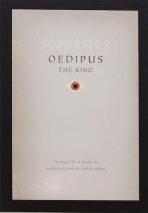 Design: Dustin Kilgore, Chicago
Art Direction: Jill Shimabukuro
Lettering: Dustin Kilgore
Publisher: The University of Chicago Press
Principal Type: ITC Tiepolo and handlettering
Dimensions: 5.25 x 8 in. (13.3 x 20.3 cm) (#99) ]]>
 Design: Erica Heitman-Ford, New York
Art Direction: Erica Heitman-Ford
Creative Direction: Matteo Bologna
Lettering: Erica Heitman-Ford
Design Office: Mucca Design
Client: Rizzoli USA
Principal Type: handlettering
Dimensions: (#98)
La Cuisine: 10.25 x 7.25 in. (26 x 18.4 cm)
La Cucina: 10.25 x 7.25 in. (26 x 18.4 cm) ]]>
 Design: Friedrich-Wilhelm Graf and Alina Günter, Zürich
Photography: Stefan Burger
Printing and Binding: DZA, Druckerei zu Alternburg
Lithography: Daniele Kaehr
Editors: Urs Stahel, Fotomuseum, and Sabine Schaschl, Kunsthaus
Publisher: Christoph Merian Verlag, Basel, Switzerland
Design Office: unfolded
Clients: Fotomuseum Winterthur and Kunsthaus Baselland
Principal Type: Berthold Akzidenz Grotesk
Dimensions: 8.3 x 10.6 in. (21 x 27 cm) (#97) ]]>
Art Direction: Christoph Sauter and Mara Weyel
Creative Direction: Artur Gulbicki
Brand Consulting: Tobias Sommer
Design Office: KW Neun Grafikagentur
Client: Stadtjugendring Augsburg KdöR
Principal Type: Sabon Next
Dimensions: 23.4 x 33.1 in. (59.4 x 84.1 cm) (#96) ]]>
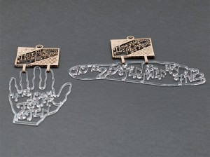 Design: Cristina Vasquez, New York
School: School of Visual Arts, New York
Instructors: Stephen Doyle and Erik Guzman
Principal Type: custom
Dimensions: (#95)
Foot: 10 x 3.5 in. (25.4 x 8.9 cm)
Hand: 4 x 8 in. (10.2 x 20.3 cm) ]]>
 Design: Seung Hee Lee, New York
School: School of Visual Arts, New York
Instructors: Kevin Brainard and Darren Cox
Principal Type: handlettering
Dimensions: 8 x 10 in. (20.3 x 25.4 cm) (#94) ]]>
School: School of Visual Arts, New York
Instructor: Olga Mezhibovskaya
Principal Type: handlettering
Dimensions: 11 x 15 in. (27.9 x 38.1 cm) (#93) ]]>

Design: Andrew Freeman and Paula Scher, New York
Art Direction: Paula Scher
Design Office: Pentagram Design New York
Clients: Society of Typographic Arts and International Council of Graphic Design Associations
Principal Type: Akkurat
Dimensions: 24 x 36 in. (61 x 91.4 cm) (#92) ]]>
Illustration: Brian Rea (Beyond Therapy)
Photography: Darren Cox
Studio: Pleasure
Client: Westport Country Playhouse
Principal Type: Alternate Gothic, Century Schoolbook, and handlettering
Dimensions: 28 x 44 in. (71.1 x 111.8 cm) (#91) ]]>
Art Direction: Hiroko Sakai
Design Office: coton design
Principal Type: Utsuroi
Dimensions: 28.7 x 40.6 in. (72.8 x 103 cm) (#90) ]]>
Art Direction: Hiroko Sakai
Design Office: coton design
Principal Type: Futura
Dimensions: 28.7 x 40.6 in. (72.8 x 103 cm) (#89) ]]>
Design Office: TryKID’S, Inc.
Client: Fuji Xerox Co., Ltd.
Principal Type: Helvetica Neue
Dimensions: 28.7 x 40.6 in. (72.8 × 103 cm) (#88) ]]>
School: School of Visual Arts, New York
Instructor: Milton Glaser
Principal Type: Odeon Condensed
Dimensions: 18 x 24 in. (45.7 x 61 cm) (#66) ]]>
Art Direction: David Plunkert
Lettering: David Plunkert
Photography: Alexander Bassano, owned by Library of Congress
Illustration: David Plunkert based on Thomas Gainsborough
Studio: Spur Design
Client: Film Shack
Principal Type: handlettering
Dimensions: 14.75 x 22 in. (37.5 x 55.9 cm) (#65) ]]>
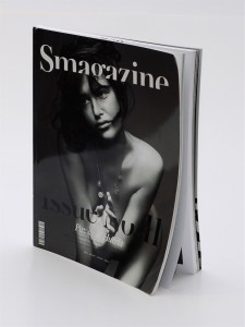 Design: Elina Asanti, New York
Art Direction: Jacob Wildschiødtz
Studio: NR2154
Client: S Magazine
Principal Type: Akkurat, Austin, and Austin—S Display
Dimensions: 9.1 x 11.8 in. (23 x 30 cm) (#64) ]]>
Art Direction: Kei Takimoto
Creative Direction: Kei Takimoto
Lettering: Kei Takimoto
Principal Type: handlettering
Dimensions: 23.4 x 33.1 in. (59.4 x 84.1 cm) (#62) (#63) ]]>
Lettering: Ariane Spanier
Design Office: Ariane Spanier Design
Client: Kulturlabor e.V.
Principal Type: handlettering
Dimensions: 23.4 x 33.1 in. (59.4 x 84 cm) (#61) ]]>
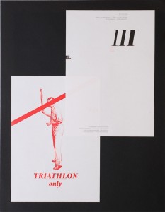 Design: Patrick Bittner, Saarbrücken, Germany
Client: Martin Malcharek, Tri-Shop-Saar
Principal Type: Romain BP
Dimensions: various (#78) ]]>
Creative Direction: Vanessa Eckstein
Design Office: Blok Design
Client: Oveja Negra Lowe
Principal Type: Blender Bold, Helvetica, Helvetica Bold, and Univers Light Ultra Condensed
Dimensions: various (#77) ]]>
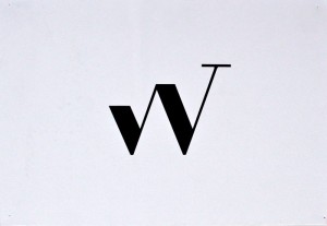
Design: Elizabeth diGiacomantonio and Joseph Traylor, Brooklyn, New York
Art Direction: Joseph Traylor
Studio: Ville
Client: Walk Up Press
Principal Type: custom
Dimensions: unknown (#76) ]]>
School: Folkwang Universität der Künste
Professors: Thomas Rempen and Peter Wippermann
Principal Type: Akkurat Bold and DTL Albertina Bold
Dimensions: 23.4 x 33.1 in. (59.4 x 84.1 cm) (#75) ]]>
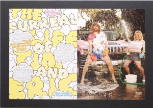 Art Direction: Drue Wagner, New York
Creative Direction: Dirk Barnett
Publication: Maxim
Principal Type: McKloud Black
Dimensions: 15.25 x 10.5 in. (38.7 x 26.7 cm) (#74) ]]>
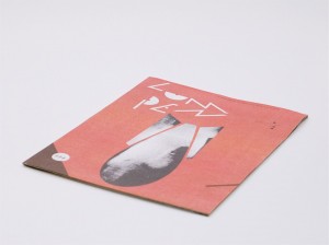 Art Direction: Jeremiah Chiu and Renata Graw, Chicago
Editor/Publisher: Ed Marszewski
Studio: Plural Design
Client: Lumpen
Principal Type: Bodoni BE, Golden Type, Univers, and custom
Dimensions: 10 x 13 in. (25.4 x 33 cm) (#73) ]]>
Lettering: Darren Booth, St. Catharines, Canada
Publisher: Grand Central Publishing
Principal Type: Neutra and handlettering
Dimensions: 6 x 9 in. (15.2 x 22.9 cm) (#72) ]]>
Creative Direction: Louis Gagnon
Lettering: Sériepop
Agency: Paprika
Client: Galerie Anatome
Principal Type: Helvetica and handlettering
Dimensions: 24 x 34 in. (61 x 86.4 cm) (#71) ]]>
Principal Type: Liza
Dimensions: 32 x 46 in. (81.3 x 116.8 cm) (#70) ]]>
Creative Direction: Matthew Remphrey
Lettering: Kellie Campbell-Illingworth
Design Office: Parallax Design
Client: Robinson’s Accident Repair Centre
Principal Type: Akkurat Mono and handlettering
Dimensions: various (#69) ]]>
 Design: Djoko Hartioko, Jordan Marzuki and Ignatius Hermawan Tanzil, Jakarta, Indonesia
Art Direction: Ignatius Hermawan Tanzil
Creative Direction: Ignatius Hermawan Tanzil
Illustration: Djoko Hartioko, Radhinal Indra, and Jordan Marzuki
Design Office LeBoYe
Client: dialogue
Principal Type: Triumph Tippa
Dimensions: various (#68) ]]>
Lettering: Christopher Silas Neal
Client: Shout Out Louds
Principal Type: handlettering
Dimensions: 19 x 25 in. (48.3 x 63.5 cm) (#67) ]]>
Art Direction: Paula Scher
Lettering: Paula Scher
Design Office: Pentagram Design New York
Client: New York City Department of Cultural Affairs, New York City Department of Education and New York City School Construction Authority
Principal Type: handlettering
Dimensions: various (#86) (#87) ]]>
Lettering: Timothy Goodman
Illustration: Timothy Goodman
Photography: Mark Dye
Client: Ace Hotel
Principal Type: handlettering with paint markers and Sharpie
Dimensions: 120 sq. ft (11.2 sq. m) (#83) ]]>

Design: Akiko Masunaga, Osaka, Japan
Art Direction: Akiko Masunaga
Illustration: Akiko Masunaga
Client: Heiwa Paper Co., Ltd.
Principal Type: original
Dimensions: 28.7 x 40.6 in. (72.8 x 103 cm) (#82) ]]>
Creative Direction: Edward Levine
Studio: Levine Design Inc.
Client: Psychology Today
Principal Type: Gotham and custom
Dimensions: 16 x 10.5 in. (40.6 x 26.7 cm) ]]>
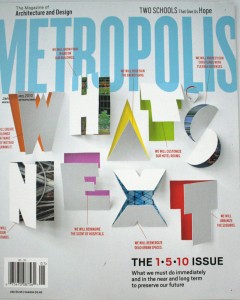
Design: Post Typography, Baltimore
Art Direction: Dungjai Pungauthaikan, New York
Creative Direction: Criswell Lappin
Publication: Metropolis
Principal Type: Scout
Dimensions: 9 x 10.75 in. (22.9 x 27.3 cm) (#80) ]]>
Client: Bettina Hanstein, Initiative Synagoge Fénétrange
Principal Type: Excelsior and Synagogue-F
Dimensions: 5.8 x 8.3 in. (14.8 x 21 cm) (#79) ]]>
Art Direction: Angelika Mathis and Verena Petrasch
Architecture: Arge HEIN-TROY & Thurnher ZT, Bregenz, Austria
Client: Elementary School and Nursery School Satteins
Principal Type: Dilthey Dot (self-created dot font) and Frutiger Next LT
Dimensions: (#85)
Glass wall: 15.5 x 78.7 x 1102.4 in. (39.4 x 200 x 2800 cm)
Doorplates: 5.7 x 5.9 in. (14.5 x 15 cm) ]]>
 Design: Jessica Walsh, New York
Art Direction: Stefan Sagmeister
Studio: Sagmeister Inc.
Client: Levi’s
Principal Type: custom
Dimensions: 19.5 x 44 ft. (5.9 x 13.4 m) (#84) ]]>
Agency: Chen Pingbo Graphic Design
Client: Shenzhen Graphic Design Association (SGDA)
Principal Type: Blackbold
Dimensions: 27.6 x 39.4 in. (70 x 100 cm) (#60) ]]>
Art Direction: Ren Takaya
Design Studio: AD&D
Client: Bihaku Watanabe Company and Tsujikawa Co., Ltd.
Principal Type: Helvetica Neue Light
Dimensions: 20.3 x 28.7 in. (51.5 x 72.8 cm) (#59) ]]>
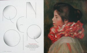
Design: Todd Albertson, Washington, D.C.
Studio: Todd Albertson Design
Client: France Magazine
Principal Type: custom
Dimensions: 9 x 10.9 in. (22.9 x 27.7 cm) (#58) ]]>
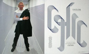
Design: Todd Albertson, Washington, D.C.
Studio: Todd Albertson Design
Client: France Magazine
Principal Type: custom
Dimensions: 9 x 10.9 in. (22.9 x 27.7 cm) (#57) ]]>
 Design: Patricia Kim, Gina Maniscalco, Maayan Pearl and Lee Wilson, New York
Design Direction: Cynthia Hoffman
Design Manager: Emily Anton
Art Direction: Robert Vargas
Creative Direction: Richard Turley
Illustration: Nick White
Publication: Bloomberg Businessweek
Principal Type: Haas Grotesque
Dimensions: 10.5 x 7.9 in. (26.7 x 20.1 cm) (#56) ]]>
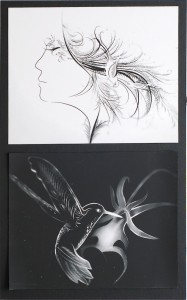 Design: Cardon Webb, East Elmhurst, New York
Client: Vintage/Anchor Books
Principal Type: Garage Gothic Regular
Dimensions: 5.2 x 8 in. (13.2 x 20.3 cm) (#55) ]]>
 Design: Stefan Sagmeister, New York
Photography: Karim Charlebois-Zariffa
Text: Stefan Sagmeister
Manufacturer: Bali Rattan, Bali, Indonesia
Principal Type: custom
Dimensions: 47.2 x 31.1 in. (120 x 79 cm) (#54) ]]>
School: California College of the Arts
Instructor: Bob Aufuldish
Principal Type: FF Meta and FF Meta Serif
Dimensions: 4 x 9 in. (10.2 x 22.9 cm) (#53) ]]>
Creative Direction: Lars Harmsen and Raban Ruddigkeit, Karlsruhe and Berlin, Germany
Project Manager: Marina Friedrich
Design Offices: MAGMA Brand Design GmbH & Co. KG, and ruddigkeit corporate ideas
Client: Verlag Hermann Schmidt Mainz
Principal Type: Copy
Dimensions: 3.7 x 5.1 x 1.6 in. (9.5 x 13 x 4 cm) (#52) ]]>
Art Direction: Lars Harmsen and Flo Gaertner
Assistant Editor: Julia Kahl
Design Offices: MAGMA Brand Design GmbH & Co. KG
Client: Birkhäuser Verlag
Principal Type: Executive and Optimo
Dimensions: 8.9 x 11.2 in. (22.5 x 28.5 cm) (#51) ]]>
Design Office: MAGMA Brand Design GmbH & Co. KG
Client: b_books, Tim Stüttgen (editor)
Principal Type: Monotype Grotesque and Times New Roman
Dimensions: 6.3 x 9.1 in. (16 x 23 cm) (#50)
]]>Photography: Richard Foster
Design Office: Pentagram Design London
Client: Haiti Poster Project
Principal Type: Courier and handdrawn
Dimensions: 27.3 x 39.1 in. (69.4 x 99.4 cm) (#49) ]]>
Design Office: Strichpunkt Design
Client: Taschen
Principal Type: AGaramond Pro, Scala Sans and Vineta
Dimensions: 6.9 x 8.6 in. (17.5 x 21.8 cm) (#48) ]]>
Creative Direction: Joshua C. Chen
Design Office: Chen Design Associates
Client: Tell Tale Preserve Company
Principal Type: Bickham Script, Craw Modern, Joanna and Knockout
Dimensions: various
Art Direction: Simon Brenner
Creative Direction: Sascha Lobe
Lettering: Sascha Lobe and Simon Brenner
Studio: L2M3 Kommunikationsdesign GmbH
Client: 100 Beste Plakate e. V.
Principal Type: handlettering
Dimensions: 16.5 x 23.4 in. (42 x 59.4 cm) (#46) ]]>
Principal Type: Courier
Dimensions: 3.5 x 2 in. (8.9 x 5.1 cm) (#45) ]]>
Printer: CTS Grafica
Studio: studio FM milano
Principal Type: Insects
Dimensions: 18.9 x 26.5 in. (47.9 x 67.3 cm) (#44) ]]>
Photography: Michael Koritschan, Studio Koritschan
Copywriter: Julius Weiss
Design Office: Thomas Lehner, Visual Communications
Client: Rezept-Destillate, Wettingen, Switzerland
Principal Type: Apotheke and Replica
Dimensions: 2.4 x 14.8 x 2.4 in. (6 x 37.5 x 6 cm) (#43) ]]>
Publisher: Farrar, Straus and Giroux
Principal Type: Pelso
Dimensions: 6.1 x 9.2 in. (15.6 x 23.3 cm) (#42)
]]>
In-House Department Anthropologie
Principal Type: Helvetica Neue
Dimensions: 3 x 2 in. (7.5 x 5 cm) (#41) ]]>
Art Direction: Stefan Sagmeister
Studio: Sagmeister Inc.
Principal Type: Pixel Belt Holes (#39) ]]>
Agency: ENJIN Inc.
Client: LOTTE Co., LTD.
Principal Type: custom
Dimensions: 3 x 0.8 in. (7.5 x 2 cm) (#38) ]]>
Lettering: Mette Hornung Rankin
Design Office: Bureau of Betterment
Principal Type: handlettering
Dimensions: 17.25 x 23 in. (43.8 x 58.4 cm) (#37) ]]>
Creative Direction: Matthew Remphrey
Lettering: Kellie Campbell-Illingworth
Design Office: Parallax Design
Client: Antipodean Vintners
Principal Type: Akzidenz-Grotesk, Newzald and handlettering
Dimensions: 7.7 x 6.7 in. (19.5 x 17 cm) (#36) ]]>
Creative Direction: Francesco Guerrera and Nicola Lampugnani
Agency: TBWA\ITALIA SPA
Client: FirstFloorUnder.com
Principal Type: Oblio
Dimensions: 27.6 x 39.4 in. (70 x 100 cm) (#35) ]]>
Agency: Herburg Weiland Design Agency
Client: Martin Wöhrl
Principal Type: Helvetica
Dimensions: 7.1 x 9.1 in. (18 x 23 cm) (#34) ]]>
Design Office: Pentagram Design London
Client: Barbican Art Gallery
Principal Type: Archer, Bickham Script Pro, Caslon Pro and Lettres ombrees ornees
Dimensions: 7.1 x 9.1 in. (18 x 23 cm) (#33) ]]>
Design Office: Rimini Berlin
Client: Revolver Publishing
Principal Type: Schulbuch Nord
Dimensions: 5.1 x 6.7 in. (13 x 17 cm) (#32) ]]>
Author: Dr. Frank Berzbach, Bonn, Germany
Marketing: Karin Schmidt-Friderichs, Mainz, Germany
Printer: Universitaetsdruckerei H. Schmidt Mainz
Publisher: Verlag Hermann Schmidt Mainz
Principal Type: Adobe Garamond and DTL Nobel T
Dimensions: 5.3 x 8.2 in. (13.5 x 21 cm) (#31) ]]>
Art Direction: Roseanne Serra
Creative Direction: Paul Buckley
Lettering: Christopher Brand
Illustration: Sam Weber
Publisher: Penguin Books
Principal Type: handlettering
Dimensions: 5.1 in x 7.75 in. (13 x 19.7 cm) (#30) ]]>
Client: 826DC
Principal Type: Block Gothic
Dimensions: 6 x 9 in. (15.2 x 22.9 cm) (#29) ]]>
Lettering: Keith Hayes and Ronald Kurniawan
Art Direction: Keith Hayes
Creative Direction: Mario J. Pulice
Illustration. Ronald Kurniawan
Publisher: Hachette Book Group / Little, Brown and Company
Principal Type: Futura Book and handlettering
Dimensions: 6.1 x 9.5 in. (15.6 x 24.1 cm) (#28) ]]>
Artwork: Karen Green
Publisher: Hachette Book Group / Little, Brown and Company
Principal Type: Gotham Book
Dimensions: 6.1 x 9.5 in. (15.6 x 24.1 cm) (#27) ]]>
Art Direction: Andy Cruz, Wilmington, Delaware
Photography: Carlos Alejandro
Photography Studios: Carlos Alejandro Photography and The Herman Miller Archive
Text Showings: Erik van Blokland and Ben Kiel, The Hague, Netherlands, and Yorklyn, Delaware
Design Office: House Industries, Yorklyn, Delaware, and The Eames Office, Santa Monica, California
Principal Type: Eames Century Modern and Eames Exhibits
Dimensions: 4.5 x 8.25 in. (11.4 x 21 cm) (#26) ]]>
Agency: Jäger & Jäger
Client: Nils Holger Moormann GmbH
Principal Type: ITC Franklin Gothic
Dimensions: 8.9 x 11.2 in. (22.5 x 28.5 cm) (#25) ]]>
Writers: Andrew Byrom and Renée Cossutta
Design: Andrew Byrom and Renée Cossutta
Clients: La Sierra University and University of Massachusetts Lowell
Principal Type: various
Dimensions: 5.5 x 8.5 in. (14 x 21.6 cm) (#24)
Creative Direction: Claire Dawson and Fidel Peña
Design Office: Underline Studio
Client: The Robert McLaughlin Gallery, McMaster Museum of Art
Principal Type: Helvetica Neue, Hoefler Text, and Hoefler Titling
Dimensions: Flat 39.2 x 10 in. (99.45 x 25.4 cm) Folded 7.5 x 10 in. (19.1 x 25.4 cm) (#23) ]]>
Translator: Ross M. Benjamin, New York
Agency: Freie Radikale Werbung
Client: Heidelberger Druckmaschinen AG
Principal Type: United Stencil
Dimensions: 7.9 x 7.9 in. (20 x 20 cm) (#22) ]]>
Design Office: Geviert
Client: C.H.Beck oHG dtv
Principal Type: various
Dimensions: 4.3 x 7.1 in. (11 x 18 cm) (#21) ]]>
Studio: Eduardo del Fraile
Client: Soso Salt
Principal Type: Helvetica Bold
Dimensions: 4.9 x 3.5 in. (12.5 x 9 cm) (#20) ]]>
Art Direction: Christine Celic Strohl
Creative Direction: Matteo Bologna
Design Office: Mucca Design
Client: Icon Group
Principal Type: One Atlantic Book, One Atlantic Text Light, and One Atlantic Light Italic
Dimensions: 2 x 4 in. (5.1 x 10.2 cm) (#19) ]]>
Studio: Eps51 graphic design studio
Client: uqbar, Berlin
Principal Type: Berthold Akzidenz-Grotesk, House Slant, Rosewood, and Soda Script
Dimensions: Books: 7.9 x 10.2 in. (20 x 26 cm) Posters: 33.1 x 23.4 in. (84.1 x 59.4 cm) (#17) ]]>
Creative Direction: Robert Louey and Regina Rubino
Vice President & Managing Director Matt Adams, New York
Vice President Culinary Operations Susan Terry, Chicago
Design Offices: Regina Rubino/IMAGE: Global Vision LLC and Robert Louey Design/Pagenova
Client: Grand Hyatt New York
Principal Type: various
Dimensions: various (#16) ]]>
Creative Direction: Robert Louey and Regina Rubino
Vice President Food & Beverage International Operations Achim Lenders, Chicago
Vice President Culinary Operations Susan Terry, Chicago
General Manager: Toni Hinterstoisser, New York
Design Offices: Regina Rubino/IMAGE: Global Vision LLC and Robert Louey Design/Pagenova
Clients: Andaz Wall Street, New York, and Grand Hyatt New York
Principal Type: ATChevalier Regular (modified) and Engravers MT Regular
Dimensions: various (#15) ]]>
Art Direction: Reginald Wagner, Hamburg
Creative Direction: Katrin Oeding
Photography: Ulrike Kirmse and Guido Stanke
Illustration: Sarah Gossner
Copywriters: Till Grabsch and Delia D. Marti
Agency: Kolle Rebbe/KOREFE
Client: Borkebjs.com
Principal Type: Borkebjs
Dimensions: 4.8 x 5.9 in. (12.2 x 15 cm) (#14) ]]>
Principal Type: Fakir
Dimensions: 5.3 x 8.3 in. (13.5 x 21.1 cm) (#13) (#70) ]]>
Illustration: Gregg Kulick
Publisher: Penguin Group (USA)
Principal Type: Gotham Rounded and hand drawn found types
Dimensions: 6.1 x 9.25 in. (15.6 x 23.5 cm) (#12) ]]>
Creative Direction: Anne Twomey
Photography: Ryann Cooley
Design Office: Catherine Casalino Design
Publisher: Grand Central Publishing
Principal Type: Briem Mono and custom metal letters
Dimensions: 6 x 9 in. (15.2 x 22.9 cm) (#11) ]]>
Design Office: Ariane Spanier Design
Client: Fukt Magazine, Björn Hegardt
Principal Type: handlettering
Dimensions: 6 x 9 in. (15.2 x 22.9 cm) (#10) ]]>
Art Direction: Elizabeth Connor
Creative Direction: Anne Twomey
Publisher: Grand Central Publishing
Principal Type: Electra and handlettering
Dimensions: 5.75 x 8.5 in. (14.6 x 21.6 cm) (#09) ]]>
Art Direction: Hana Nakamura
Creative Direction: Matteo Bologna
Lettering: Melissa Chang
Design Office Mucca Design
Client: Rizzoli
Principal Type handlettering
Dimensions: 8.75 x 5.5 in. (22.2 x 14 cm) (#8) ]]>
Design Office: Christopher Sergio Design
Publisher: HarperCollins Publishers
Prinzipal Type: Fette deutsche Schrift and Knockout
Dimensions: 6.25 x 9.25 in. (15.9 x 23.5 cm) (#7) ]]>
Office A2/SW/HK
Client: A2-TYPE
Principal Type various
Dimensions: 5.9 x 8.3 in. (15 x 21 cm) (#6) ]]>
Creative Direction: Jan Kruse
Agency: Ligalux GmbH
Client: fischerAppelt, relations GmbH
Principal Type: Archer, Candice, Dot Matrix, Gotham and FF Karo Dot
Dimensions: 3.8 x 5.8 in. (9.6 x 14.8 cm) (#5) ]]>
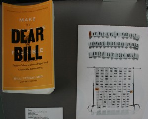
Design: Craig Welsh, Lancaster, Pennsylvania
Studio Go Welsh
Client: Society of Design
Principal Type Gothic wood type
Dimensions Closed: 5 x 8 in. (12.7 x 20.3 cm) Opened: 100 x 8 in. (254 x 20.3 cm) (#4) ]]>

Design: Masayo Anton-Ozawa LinkedIn Profil New York
Photography: Stebe, Deer Park, NY
Principal Type: handlettering
Dimensions: 5 x 7 in. (12.7 x 17.8 cm) (#2) ]]>

Design: Katy Fischer, St. Louis, Missouri Eric Thoelke
Copywriter: Geoff Story
Studio TOKY Branding + Design
Client: St. Louis Public Library Foundation
Principal Type: typewriter
Dimensions: 4.5 x 6.25 in. (11.4 x 15.9 cm) (#3) ]]>
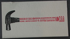
Oliver Mundays Website
Client: Robson Desouza
Principal Type Univers
Dimensions: 3.5 x 2 in. (8.9 x 5.1 cm) (#1) ]]>