#T1
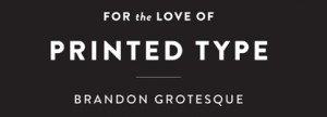
Typeface: Brandon Grotesque
Typeface Designer: Hannes von Döhren, Berlin, Germany
Foundry: HVD Fonts
Members of Typeface Family/System:
Thin, Thin Italic, Light, Light Italic, Regular, Regular Italic, Medium, Medium Italic, Bold, Bold Italic, Black, Black Italic
Designer’s Concept:
My father gave me some magazines from the 1920s and 1930s, which he had found at my grandfather’s; he thought I should have a look at the hand-lettered advertisements. I was fascinated by the surface feel and by the general atmosphere of these magazines; the way the body type was set and the various combinations of typefaces and hand-lettered headlines.
I absolutely wanted to create a typeface with that kind of feel. A geometric face that nonetheless would possess a certain softness and warmth. Because of “bad” printing, the text faces in those magazines had slightly rounded corners, lending them an emotionality that today’s clean-cut type lacks. So I decided to give Brandon slightly rounded-off corners to allow it to radiate warmth in spite of its geometric clarity. Although Brandon with its 12 styles is a relatively large family, each weight has its own aesthetic, for while the weights are based on each other they were all drawn separately in order to give each variety its own details — like the various ‘g’ variations or the perfectly round counters in the Black weight. A real italic was designed to provide additional individuality and to distinguish the font from most other geometric sans faces, making it even more ‘human’.